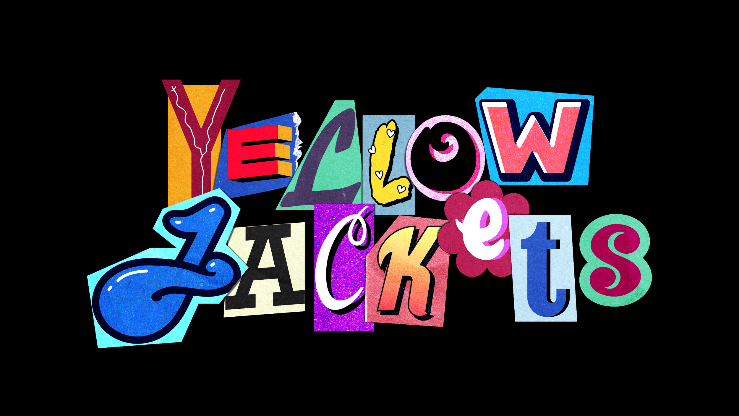
Yellowjackets - Title Design and Animation Process (fan art project)
TV series tells a story about a high school girls soccer team that survives a plane crash deep in the Canadian wilderness in 1996.
*This is a fan art project, not an official artwork for the show.
TITLE DESIGN
Since the story takes place in the 90s, the visual references I used for the title are collage, ransom note, and teenage girl diary aesthetic.
References
PHASE ONE - Rough sketches and concepts
I started the process by gathering references and making a mood board for letters placed outside the canvas.
The following step was to sketch all the letters for the title in black and white. The reason I used a grayscale scheme in this phase is because I wanted to focus more on the shapes and less on the texture and final rendering details, which comes later in the process.


After sketching all the letters, I then combined them and made a few concept variations of the title.
PHASE TWO - Vector and colors
Once I was satisfied with the finished result, I had to turn all the chosen letters into vectors.


Coloring time! :)
Before I added any details or texture, I first applied flat colors and made minor placement adjustments. Only the title I end up choosing out of these options goes through the final editing phase.


PHASE THREE - Textures and details
In the final phase, the letters get the paper-magazine texture and overlapping shadows to achieve a realistic look.
Each letter is overlaid with two or three paper textures, which are set in a different blending mode (mostly in soft light, color dodge, add, and divide).
Next, I applied a tint of color to shadows (not full black) with 40-60% opacity.
ANIMATION PROCESS
The concept behind the video was to illustrate how the diary of one of the girls got destroyed, using a collage sequence animation style. I wanted to visually tell a story of a girl's psyche throughout the time she spent in the wilderness.
PREPARATION
The video is intended for a social media reel format. The settings for the composition are vertical 9:16 resolution, with 24 fps.
Before I started the animation process, I exported every letter separately to a transparent PNG file and then imported them to the composition.
PHASE ONE - Teenage Dream
Phase one consists of a two-second loop animation where each letter has a separate scale, position, and rotation transition.
The letters are clean as a fresh new diary, and the animation is cheerful.
PHASE TWO - Mood Swings
In phase two, I started adding new elements around the title. In the form of doodles, these sketches narrate the state of mind from bored to terrified.
The composition is a play on opposites, from innocent heart shapes and nature motives to darker themes, like knives, skulls, and flame drawings.
I drew the sketches with red and blue pens and some pink highlighter. The level of detail varies, some lines are clean, and some are sloppy.
As the different motives appear one by one, the animation shows a timeline of the group's moods, emotions, and especially hope.
PHASE THREE - Far away from home
The final phase is where the five stages of diary destruction unfold, mirroring the survival journey of the main characters.
As the pages of the diary are ripped and pulled away from the superficial facade, the characters face the unexplored. The diary is therefore a symbol of the many layers underneath the skin, of our deeper conflicts, fears, and animalistic traits.
The title fades through this process, a hint at stepping out of the familiar and the comfortable.
The whole video is rendered as a 15-second loop animation.
Editing software: Affinity Designer and Blender
The used textures are from Texturelab.


